Showing posts with label Creative Charms. Show all posts
Sunday, May 15, 2011
Papercraft Star Challenge
This card was way outside my comfort zone. The Papercraft Star challenge is something metal or a button (I have three green metal flower brads), either a stamp or a die cut (I have the stamped sentiment) and at least two patterned papers. Then there was an inspiration photo. This is the photo.
When I was looking for papers I was picturing the red/pink color as much more pink. I still think it uses the picture as inspiration (especially for me given my comfort zone is as far away from pink as you can get.)
Here is a close up of the brads and the pink flower pattern paper (from ki memories -- Friendship stack).
The brads are from my pals at Creative Charms, as is the big green heart.
The Wonderkid has already laid claim to this card. He "helped" me put it together.
Friday, April 1, 2011
Hello Friends -
I have a couple of quick posts for you this week. The Wonderkid is on spring break and we are headed to ...
No, it isn't Disney, or even Florida, or even the beach. The Wonderkid and I are going to beautifulsunny snowy Ohio. When I traveled for work all the time I would complain about the fact that I was sent North (colder part of the country) in the winter and South (hotter part of the country) in the summer. So, now that I control my travel a bit more what do I do, I go North when everyone else in the world is going South.
And, Ohio, dion't get me started. If it wasn't the homeland I certainly wouldn't spend a serious amount of time in Columbus. However, when Granny is 93 and still kick around with most of her marbles, you go where she is and don't complain. It warms my heart for the Wonderkid to spend time with his Great-Grandmother and you want to see someone that thinks he is a WONDERKID!!! Watch out world, Granny will be telling you about her genius Great Grandson.
All of this is the long way of telling you I had to hurry to get my crafting in before we start the long trek north. Did I mention I had to take my winter coat out of storage? I put it away thinking I was done with winter, I forgot about this little excursion.
A couple of things about this card. Number One, the image is from Bugaboo Stamps. Isn't he a cutey? Now, do you think people will get hung up on the fact that he is an Easter turtle? Who ever said an Easter bunny makes any sense, anyway? And for my friends North of the Boarder (meaning Canada not Tennessee) she has this little guy with a Canadian flag and Maple leaf on his shell.
Number two, what do you think of those buttons?
These are the ones I'm talking about. Aren't they cute? So, I've been eyeing a little gizmo from Epiphany Crafts. It will allow you to make a button with any cardstock backing you choose. I think I'll do a product review after I've played with it a bit more but so far, I'm having fun. Here is a link to find them. My Archivers was selling them when I went in this week. They were also demoing them. I had looked all over for a place to buy them and was still doing a price comparison when they were staring me in the face and I had my 40% off coupon. How could I pass them up.
Finally, I cracked my stash of Creative Charms open, again. The butterfly is one of the many ones I keep buying and then saving because they are just so cute.
Well, I just went to check on the link for this little gem and didn't notice they changed the day their challenge is due. It normally goes through Saturday morning but this week it was only until Friday. Oh well, thems the breaks. You still get to see a fun green card. (The challenge was monocromatic and three buttons).
I'm curious, how do you start your creations? Do you begin with a sketch, challenge, picture, paper, color or do you have a final goal and work from there?
I have a couple of quick posts for you this week. The Wonderkid is on spring break and we are headed to ...
No, it isn't Disney, or even Florida, or even the beach. The Wonderkid and I are going to beautiful
And, Ohio, dion't get me started. If it wasn't the homeland I certainly wouldn't spend a serious amount of time in Columbus. However, when Granny is 93 and still kick around with most of her marbles, you go where she is and don't complain. It warms my heart for the Wonderkid to spend time with his Great-Grandmother and you want to see someone that thinks he is a WONDERKID!!! Watch out world, Granny will be telling you about her genius Great Grandson.
All of this is the long way of telling you I had to hurry to get my crafting in before we start the long trek north. Did I mention I had to take my winter coat out of storage? I put it away thinking I was done with winter, I forgot about this little excursion.
A couple of things about this card. Number One, the image is from Bugaboo Stamps. Isn't he a cutey? Now, do you think people will get hung up on the fact that he is an Easter turtle? Who ever said an Easter bunny makes any sense, anyway? And for my friends North of the Boarder (meaning Canada not Tennessee) she has this little guy with a Canadian flag and Maple leaf on his shell.
Number two, what do you think of those buttons?
These are the ones I'm talking about. Aren't they cute? So, I've been eyeing a little gizmo from Epiphany Crafts. It will allow you to make a button with any cardstock backing you choose. I think I'll do a product review after I've played with it a bit more but so far, I'm having fun. Here is a link to find them. My Archivers was selling them when I went in this week. They were also demoing them. I had looked all over for a place to buy them and was still doing a price comparison when they were staring me in the face and I had my 40% off coupon. How could I pass them up.
Finally, I cracked my stash of Creative Charms open, again. The butterfly is one of the many ones I keep buying and then saving because they are just so cute.
Well, I just went to check on the link for this little gem and didn't notice they changed the day their challenge is due. It normally goes through Saturday morning but this week it was only until Friday. Oh well, thems the breaks. You still get to see a fun green card. (The challenge was monocromatic and three buttons).
I'm curious, how do you start your creations? Do you begin with a sketch, challenge, picture, paper, color or do you have a final goal and work from there?
Monday, February 28, 2011
Tiddly Inks Shaker Card and Sketches in Thyme Challenge
Good morning all. Pull up your chair. I've got a few things to show you today. However, I'm going to start with the fun news. I received an email this morning saying I WON!!! Creative Charms does a giveaway most months. This month, I won the kit of the month. You can see it here. It shouldn't be long before they have the new kit of the month posted, also. So, I would check it out. I was just thinking I need to order more velvet ric-rac from them. Now, I have black on its way to me. Isn't this fun. I love getting goodies in the mail (although recently my UPS driver asked if I was ordering bricks).
Now that I've shared my little bit of fun, how about some eye candy for you. In fact, I have two cards to show you. Lets start with the Tiddly Ink card.
This is a shaker card. The image is on the card base. Over the image is a piece of acetate (I used part of the packaging from a sizzix embossing folder) then I put a strip of pop dots all the way around the edge. On top of the pop dots was a second piece of acetate (the other half of the packaging) and finally a frame to cover all the "inners".
Here is a side view of the card so you can see the layers.
and another showing the impossible little bits of pop dots.
The next time I do this I will have a strip of pop dot tape instead of a hundred little pop dot squares.
In between the two pieces of acetate and in the middle of all those pop dots is sand. The Wonderkid has a sandbox (courtesy of PopPop) with it comes sand, EVERYWHERE. So, I decided to "borrow" a little bit of it. Just so you know, a little goes a long way when you are talking about shaker cards.
Here is the sand and the image.
I used two Tiddly Ink images for this card. The main image is Sandy Memories. If you notice, the little boy on the left has a bit of a sun burn. The little boy on the right must have a good mommy who puts lots of sun screen on him. The crab, starfish and sand dollars come from Don't Be Crabby. I printed about a dozen sets of the starfish and sand dollars and colored them, cut them out and afixed them to the frame of the card.
I finished it off with a button from my stash (I think it was a bag of buttons from JoAnn's) and some of my new baker's twine from the Kraft Outlet.
So, do I have you thinking about shaker cards you could do?
I need to digress for just a moment. I ordered a few things from Christy at Tiddly Inks yesterday and I screwed up when I did the ordering (I should have waited another minute for the download button but I didn't). So, I emailed Christy asking if she could help me out. She was a real trooper and stuck it out with me until I had my images. Now THAT is customer service because I'm certain she had something better to be doing than emailing with me bright and early on a Sunday morning. Thanks, Christy.
OK, moving right along. (Now I have the Muppet Song stuck in my head. Do you remember it? Click the link if you want to hear it.)
Sketches in Thyme card.
As the name says, this is a sketch challenge. Here is a copy of the sketch.
Do you think I followed the design? What do you think of the card? I'm very pleased with the way all of the colors pulled together. The only thing I think it needs is some embossing on the light green section. The light green is Core'dinations, the dark green is Bazzille and the pattern paper is some that I picked up last week at Archivers. The ribbon came from my stash.
Can you see the little pieces of bling on the dark green? They are Queen and Co pearls which are specifically designed to coordinate with the Core'dinations papers. I have been eyeing them since Core'dinations did a post about them but I just hadn't purchased until recently. This color is called Shamrock, so I had to use it. The sentiment is one of the $1 stamps from Studio G. I picked up two of them last year and now I get to finally use them.
Thursday, February 24, 2011
Kraft Journal Bling Challenge and Cooking with Cricut
Before I get into my card, I have tons of Kraft Outlet/Journal news.
First, if you look on the right side of my blog there is something new. I WON!!! Can you believe it? I was one of the top three at the Kraft Journal last week. You can see the card here. I was so excited and honored to have won. They had a number of wonderful submissions for the challenge, I especially liked Jan from Chai Tea 'n Me. And any time I see Laurel from Seabrook Design I know I'll be in for a treat. You should definitely check out the other entries.
In addition, my order from Kraft Outlet arrived. I can't wait to start playing with my dictionary pages and library cards and library envelopes. It is going to be fun. If you haven't had a chance, check out their cool stuff.
Now for my card. The challenge at Kraft Journal is bling and the challenge at Cooking with Cricut (remember this is not a Cricut Cake site, it is paper cutting and they have a ton of cool cuts) is swirly and twirly. Now, I'm not a huge bling person. I think it is one of the reasons I like kraft paper so much. Kraft paper feels more organic and not so formal. However, I rose to the challenge and channeled my inner princess.
The card base is kraft. I tried to decide if this would have worked with white or cream cardstock as the base and I came to the conclusion, no. It really looks best with the kraft. The pattern paper and the three layers above it are all DCWV's Amber Autumn stack and coordinating cardstock. I must say, I looked at these papers a number of times and thought I would never use them but I'm very glad I had them.
Here is a close-up of the cut. It is from the Martha Stewart Elegant Cakes cart. Isn't it absolutely wonderful? I cut it at 4 3/4 inches. The bottom layer (darkest brown) is a glitter cardstock which cut amazingly well in my Cricut. The middle layer is the shimmery brown and the top layer is the blue. All three colors are also in the bottom layered pattern paper. I can see a number of additional cards in these wonderful Martha Stewart carts.
Then came the bling. I used my favorite, Creative Charms, gradient gems. I chose the largest brown gems and the next size down in clear and blue. What do you think of my bling?
Then, to finish off the card...
I added an 1 1/2 strip to the inside to dress it up just a big.
Does it look swirly and twirly? How about bling? Do you think I got it right? What would you recommend changing or adding?
Monday, February 21, 2011
Sketches in Thyme
I don't use sketches very often for my cards but I tried one a couple of weeks ago and it turned out lovely so I thought I would try another. The sketches at Sketches in Thyme always seem quite lovely so I started in on this week's challenge.
It wasn't until I went to confirm what time the challenge is due that I noticed the card I had just completed was NOT for this week's challenge but instead used last week's sketch. Oh well, I love the way it turned out. So, here are both of my cards.
The first card (the one that follows last week's sketch) uses more of that stunning Graphic 45 paper, Fashonista.
I used one of the ATC sized images for the central feature. I made an off center mat in black with three lovely vintage flower brads from Creative Charms. I then stamped the sentiment using Versamark and black embossing powder. I don't have a circle punch large enough for the stamp so I used my Expression to cut it out. Believe it or not I was able to cut the circle without using Design Studio. I used the center point feature by pointing the blade in the middle of the stamped image.
Here is a close-up of the image. I think it is amazingly close to centered. It looks pretty good when you aren't seeing it enlarged at this level. I used a Tim Holtz stamp for the writing on the bottom of the card base. Instead of using a ribbon, I decided to use a strip of black paper. The card base and the sentiment circle were inked with Antique Linen Distress Ink.
This is a close-up of the main image with the Creative Charms vintage brads.
But that isn't all I have for now. Here is the card for this week's challenge.
I used Anna Griffin's Flora Collection. I bought this on clearance at Hobby Lobby a couple of months ago. I don't know if it is still in stores or not. When I went searching for a link, I found out it was released in 2009. I love this stack, and I'm not normally a huge fan of Anna Griffin but the colors in the stack are very rich and wonderful. I love the browns and she also has some papers with brown and a deep red. It is incredible. All of the paper is double-sided so I used the front for the rosette and the flower inset. I used the back for the top half of the card.
Once again, I pulled out my Creative Charms embellishments and used some chocolate brown velvet ric-rac and a velvet poppy. I switched out the pearl brad in the center of the flower and replaced it with the vintage amber brad. If you click on each of the items, you can go directly to the page where Creative Charms sells each item.
In this picture you can see I have added a piece of the cardstock from the bottom of the front of the paper to the dark brown card base.
I hope you enjoyed both of my cards for today. I'll be back with one more, a monochromatic card.
Saturday, February 5, 2011
Bugaboo Digi ATC
Have I mentioned how much I hate the color pink? Well, these are pink, that is for certain.
I'm not certain I'm made for ATC's. For one thing they really are very small. It took everything I had to be able to stay inside the lines on my coloring. I also hated cutting off this little Skelekinz' boots but I think it looks better on the ATC that way than this...
The one in the middle has all of the boots where as the ones on either side have the boots cut off. If you want to purchase this little cutie, you can find her here. I used some BRIGHT pink paper from my stash for the base of the ATC. I cut the stamp out using a Large Deckled Rectangles from Spellbinders. I thought it had the right feel for the Skelekinz. I used gradient pink gems from Creative Charms on the bottom of each ATC. They range from clear to three shades of pink.
Here is a close-up of the ATC. In this picture you can see the embossing I did with my new cuttlebug folder, Love is In The Air. I bought it at Hobby Lobby with a 40% off coupon. I love the fact it has 3 embossing folders 5 x 7.
Here are two of them a little closer. The one on the right has no embossing. The one on the left is embossed but the boots are cut off.
Sunday, January 30, 2011
Kraft Explosion Box
I want to show you a fun project today. It is an explosion box using kraft paper, brown paper and cream paper with just a little bit of red. I really pushed myself on some of the techniques but I'm so pleased with the way it turned out. It just goes to show, trying something new can be very rewarding. The cuts were all done using my Cricut (it requires a 12 x 12 mat) and SCAL2. I used an SVG from SVGCuts. You can find the explosion box here.
First the top. I have never made paper rosettes before. I love them, I've been eying them but I hadn't tried them. I must say, I think I'll be doing more. This rosette is two strips of kraft paper, each 2 inches wide. I then scored them every half inch, glued them together and pushed the middle down so it would fan out for the rosette. I then glued a one inch circle to the back of the rosette and the heart with the twine through it to the top of the rosette.
Here is a close-up of the top.
On the edge of the top, I glued a piece of velvet ric-rac from Creative Charms. I love the way the velvet ric-rac looks with the kraft paper. It is elegant with out being inappropriate. I also used Crackle paint along the sides of the top. I used Rock Candy so it would have texture without adding color.
I think this side is my favorite. You can see the velvet ric-rac again. I heat embossed the LOVE stamp on the pocket. I also heat embossed a great Tim Holtz stamp to the tag.
Isn't that fun. The final thing on this side, I used Versamark to give the kraft paper a little bit of texture. I stamped the LOVE stamp under the pocket and through out the side.
This is another side. The flower is part of the cuts from SVGCuts. The brad in the middle is one of the very fun ones from Creative Charms.
Here is the explosion box opened up. Doesn't it look fun. All of the pictures were taken at one sitting this last Thanksgiving.
You can see more of the velvet ric-rac and the brads in the middle say "We Love You". They are from the Spare Parts by the Paper Studio. It is the Hobby Lobby line of products.
Here you can see more of the mats. I put pictures on the back of each side, in addition to the front. I never print pictures at wallet size (and normally don't know that to do with wallet sized pictures when I get them) but this was the perfect size. On the inner pages I really couldn't frame or mat them but the second and third level was perfect for matting.
One last shot of the pages.
I think there will be more explosion boxes in my future. They are sooo much fun. Thank you for looking and let me know what you think.
Thursday, January 27, 2011
Graphic 45 Communique Collection - Part 1
I'm so excited about today's card(s). I swear this first one created itself. I love Graphic 45. The colors are so vibrant and fun. The designs are sophisticated and easy to use. I just eat them up. I saw some of the new Graphic 45 line coming out at CHA this week and it didn't disappoint.
Here are two cards.
The ribbon is from Hobby Lobby. It is a lovely black with a slight ruffle. The black cardstock is recollections line from Michaels'. The red cardstock came from my LSS and they don't label ANYTHING. I have a TON of embellishments from Creative Charms. I absolutely love them, in fact I love them so much that I hate to use them. If you haven't had a chance to see their store, you can go here. Luckily, I love the Graphic 45 so much, I hate to use it so all of this worked well together. I swapped out the pearl center on the velvet flowers for one of the small vintage brads. The sentiment stamp is from Hero Arts. I'm in love with this line. It has fun phrases and great images. The edges are inked with Color Box Terra Cotta ink.
Here is a similar card.
I loved the idea of an old-fashion phone. In fact, I found three or four carts with a phone but I thought this one would look the best. It is from Summer in Paris. I bought this cart last summer and I think this is the first time I've ever used it. It really is sad because it has lovely images. I'm thinking I might use some other cuts with this paper line.
I used another velvet flower from Creative Charms. I also added some of the black gradient gems. I decided the card needed a little more so I used glossy accents on the bottom of the phone. I'm not certain how well I like it. Maybe it'll work when it is completely dry. It looks a little messy right now.
Finally, I have a sneak peek for you. I'm not done playing with this line from Graphic 45. Here is a part of tomorrow's card.
Dress forms seem to be all the rage these days. I thought I would add one but I'm going to need to decorate it a bit. What do you think I should do? Check back tomorrow for my ideas.
Thursday, January 13, 2011
Kraft Thank You Card with a Florish
One of my favorite things to craft with is Kraft paper. I know it is brown and doesn't have a lot to it but it has such an organic look to it and I love to use it as a base. I'm not crazy about white (too easy to get dirty) and cream, vanilla, beige can be tough to match. I have some "cream" colored cardstock that has way too much yellow in it. In fact, it probably should be called "butter". OK, ok, enough about my love of Kraft paper and lets get on with it.
I recently found a blog and company the Kraft Journal and Kraft Outlet. Oh boy, this could be fun. They did a challenge this week to make something with a flourish. At first this doesn't seem to fit together. Florishes are fancy and elegant, Kraft paper is organic and down-to-earth. However, I wanted to play along. I decided to be very literal with the design. Here is my design. I used my Cricut Expression to cut the file. Don't blame the Cricut for the edges on the dark brown cardstock. It actually looks much better in person. It is funny, some things look better on the blog and others look better in person. I get very frustrated with dark cardstock with a white core. This is one of those.
This is a thank you card for a friend of mine. I don't think she is reading my blog so it should be safe to show before she actually receives it. The florish is a free file from SVGCuts. You can find this cut (already laid out as an A2 card) here. While you are there, I recommend looking at their other cuts. If you have SCAL and a Bug, you will love their work. It cuts like a dream and really is quite beautiful.
I used it in my SCAL2 program. It was designed as the top layer (the one on the right) but I wanted to add a shadow to it. SCAL has a wonderful feature allowing you to make a shadow or a blackout shadow of anything you choose. You can make just a tiny shadow or a much larger shadow. Or you can make a blackout of the items. This function is under "appearance" on the right side when you have the handles highlighted on an object. If you haven't done anything, it will say "Normal" if you want a shadow, you have seven options on the pull down menu (pointy, rounded and straight shadow, blackout, pointy, rounded and straight shadow blackout). Then you choose how thick to make your chosen option.
I also used SCAL2 for the lettering. I hate my handwriting so it is unlikely you will see me printing anything. Therefore, I love to use my Cricut to do headlines or lettering such as this card. I have a full set of the Cri-Kits pens with the holder. I love them. They work so much better than the ones that come from Provo Craft (mostly because they aren't markers, they are pens) and they work better than my old method of inserting a sharpie or gel pen into a pencil holder and then trying to get the placement "just right" so I could get a nice line. This font is part of the Lucinda package of fonts and was already loaded into my computer.
As much as I like the organic look of Kraft paper, I decided the card need a little bit of bling. I used a combination of embellishments from Creative Charms (another favorite of mine) and Recollections, the Michael's brand. I think they look great together. If you haven't checked out Creative Charms, I highly recommend them. They have a Deal of the Month and Kit of the Month. I love them and this months is great for valentines.
I hope you liked my card. I'll try not to "talk" so much tomorrow.
Tuesday, December 21, 2010
Calendar
I have given away my first large present of the year. I made a calendar using Designer's Calendar. In the past I have used one of those programs to make calendars for my family and friends. You know the ones, it seems everyone in the world offers them. I made mine with Costco but Snapfish and RitzPix and everyone else out there offers them. My frustration with those calendars is they force you into one of their boxes. You get a template (maybe a couple) and you must fit your pictures into that template. Often times I don't want the entire pictures (I never said I was a great photographer, many of my pictures seem to be off center). Or, I will want a vertical picture with two horizontal pictures and that isn't an option with them.
When I first saw Designer's Calendar I knew I wanted it. I love the idea of making calendars, they are practical and allow me to display photos.
This cart has some neat features. It has four fonts (base, script, boxed, circled) and it has a ton of word art (although it seems to be a little American centric -- Columbus Day is one of the pieces of word art). Because I knew I was going to be cutting out 12 months worth of calendars, I didn't want to mess with each and every day needing to be laid out separate. Therefore, I used the boxed numbers, months and days and welded them all together. By doing this, I was able to make a "lace" out of the calendar which I then glued to another piece of cardstock.
Here is the way it looked in Design Studio. The months are all the same length, I used the same days and copied them to the next month, then I only needed to make certain I started the month on the correct day (and remember which ones have 30 or 31 days).
As you can see, I have hidden the outside of the box going around each number. The box is blue, not black like the number. My only frustration with this project came when I wanted to save the calendar. Because I only hid one contour (the outside of the box) I couldn't save it. Each time I want to cut one of these, I need to go back and hide the appropriate contours. I tried hiding two contours and copying each number over top of itself so I could hide two contours on each (thus making it possible to save the hidden parts). On the first two pages where I tried this, it randomly cut different contours. It was frustrating enough (and I had so little time) that I quit with the idea that I'll go back and figure it out later.
![]() |
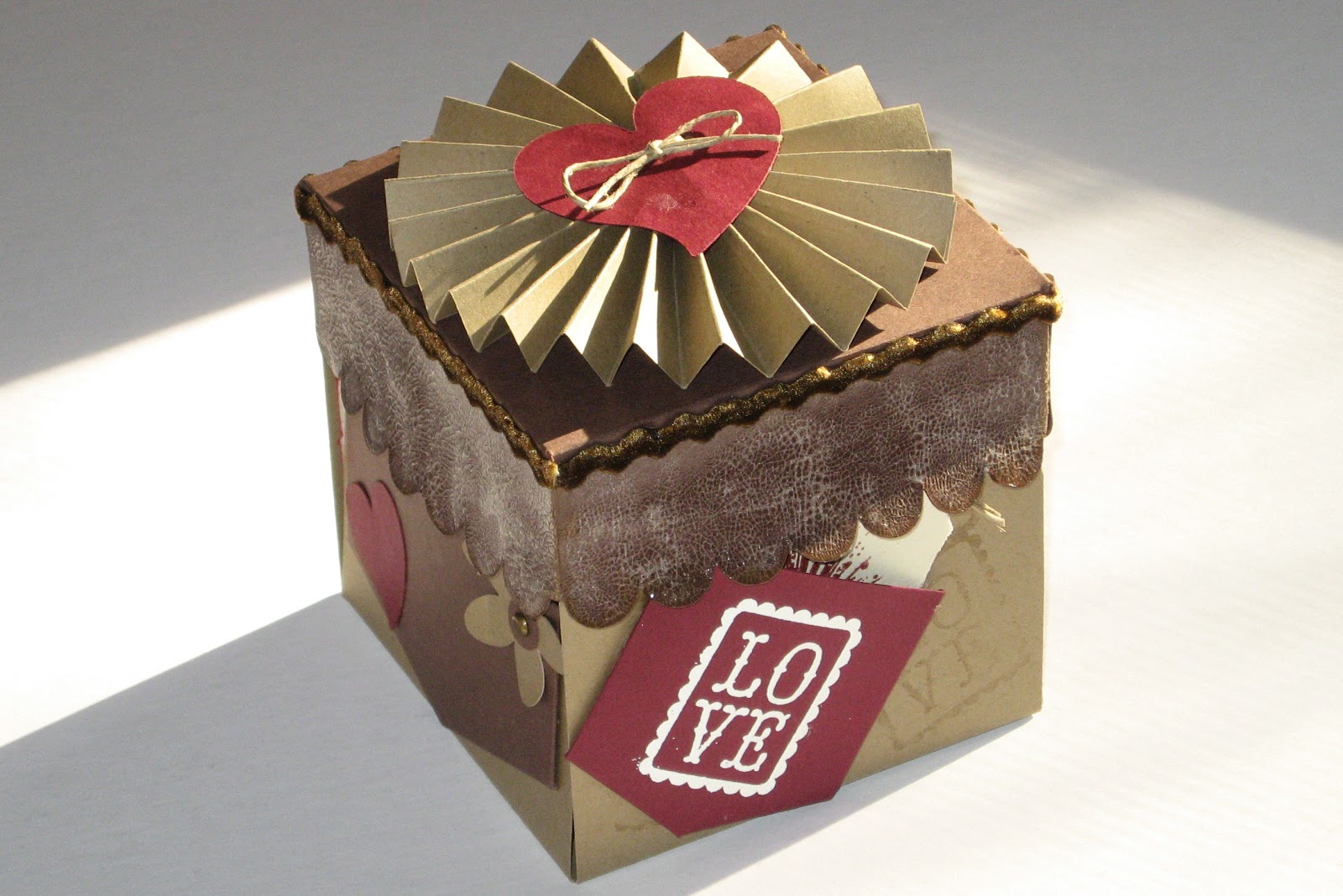
| The base cardstock is Core'dinations, the pattern paper is from a company called Gartner in Minnesota. |
![]() |
| The pattern paper is from DCWV's Animal Crackers and the base brown is from Cloud 9. |
Here are three of the months. I loved the way they looked using patterned paper and a solid paper. I used paper from more companies than I can name. The holly paper for December was from Paper Studio which comes with the coordinating cardstock. Paper Studio is sold by Hobby Lobby. I bought this stack in July of this year.
So far, all of the pictures look a bit plain. It wasn't all that way. Here are some of the other pages.
I love this page. I'm not normally a fan of the pink but I think this came out nice. I created the strip of hearts in Design Studio using the Love Struck cart. The large valentine heart is from the same place. If you are a fan of Design Studio (as I am) I will warn you that the keyword search never finds any of the hearts on this cart. I don't know why but I have taken to using CricutSearch.com because of this problem, especially.
I used a K & Company stack for the patterned paper and Core'dinations for the embossed hearts. I also used buttons from JoAnn's to decorate the empty spot at the top. I used a technique from Enfys at Going Buggy. If you haven't had a chance to check out her blog, I highly recommend it. She does some incredible inking and great cards, layouts etc.
Isn't this a fun page? I used Walk In My Garden for the flowers and then the other embellishments are from the very wonderful Creative Charms. I absolutely love their products. The butterflies, ribbon and jewels are all from Creative Charms. You can find them here. I have some of their velvet poppies which are very elegant but I have so much trouble convincing myself to use them.
Here is a close-up of one of the butterflies, some of my stitching and the ribbon. I also inked the edge of the flower using my bic markers. I loved the effect it made by soaking into the paper in different ways.
The cardstock is Core'dinations White Wash and the pattern paper is the Basics from the Paper Studio. I am normally a huge fan of the Paper Studio but this stack was one of my worst purchases. None of the colors coordinate with ANYTHING. They are all just a little bit off. However, in this situation, I was able to use some of the blue.
I know this page is a bit plain but I'm loving it none the less. Isn't the owl cute and he matches so nicely. The pattern paper is from KI Memories' Little Guy stack. I bought it at JoAnns. It just goes to show, you can find what you are looking for in some very odd places. The recipient of the calendar was in a sorority and their mascot was an owl so I added this little guy to this page.
It is a little plain but fun none the less. You can't tell from this photo but I embossed the frames using my cuttlebug and the damask folder. The sun and bee came from Create A Critter.
It is tough to see but the wings on the bee are made using the packaging from one of my carts. I embossed it using dots. I think I should have inked it also but I was starting to run out of time and energy.
Tomorrow, I'll show you more pages of this project. I have some really neat stuff to add but this is getting a bit long.
Subscribe to:
Posts (Atom)


