Showing posts with label vinyl. Show all posts

Sunday, March 20, 2011

Farmers Market

This weekend I sold Jams, Jellies, Fruit Butters and Pickles at my first Farmer's Market.  I've had lots of friends tell me I should do this and for some strange reason I was resistant.  No longer.  I'm a convert.  I sold 165 jars in about 4 hours.  It was a great day and I'm almost out of stock.  I think I can do one more market before canning season starts again.

In preparation for the Farmer's Market, in between working on contracts and the normal things that happen in day-to-day life, I made a couple of table top signs and the Wonderkid's school asked for banners to let people know about the Garden Activities during the Market.
Table Top signs with the start of a logo.

I'm still working on the logo so all comments are welcome (constructive criticism especially).  I want something that I can use for the canning and for crafting.  I would like to put it at the top of the blog and make it the header for my emails.  It should be friendly and approachable, a little homey maybe but still somewhat creative and fun.  I like the idea of a handwriting font although I'm not sold on this one, yet.  I was hoping the drops could look like ink drops or they might be splatters of tomato sauce, blueberry jelly, etc.  Did I achieve any of my goals?

Here are closer views of both of them.  I cut everything out of vinyl (easy to remove once I have landed on a final version).


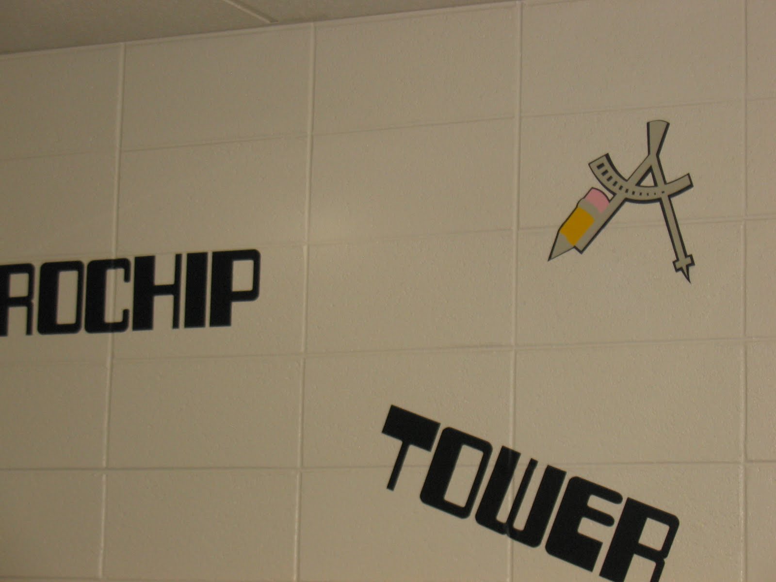
Here are the banners for the school's activities.  Remember that I had this request on Wednesday for a Saturday morning event.  Not a lot of time to get everything together. I was cutting at 2 AM and weeding while I waited in line at the large trash amnesty day in our town.


I wasn't the one to hang either of these.  I probably would have done them a little different.  The next one is pulling because they taped it to the supports.  Oh well, I really need to have more hours in the day.

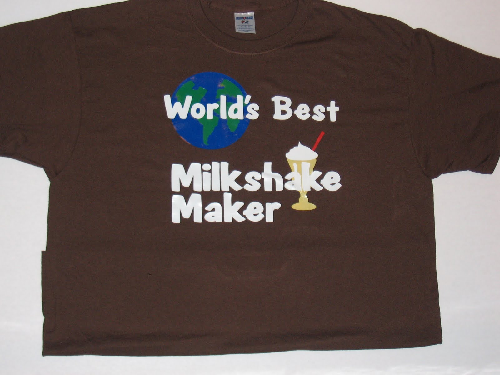
The Wonderkid wanted in the picture.  He is also wearing on of the shirts I made for him last year.
The lettering is from the Cherry Limeade cart.  The flowers and watering can came from the April Showers cart.  I need to remember this font more often.  It is a lot of fun for a sign like this.  I really needed a bit more time to make the cuts work the right way.  It is a bit of a bummer that it isn't a bit nicer.  I keep trying to remind myself that it was only up for about 4 hours.

SPRING IS HERE
Spring has finally arrived in Atlanta.  I was reading  a post from the Scrappy Jedi and she made me think.  

It was a wonderful post about how not to work on your birthday.  Now, I happened to be reading it the night after my birthday and bemoaning the fact that I was crazy busy on my birthday.  However, she showed an incredible picture of a cherry blossom and I kept thinking I should at least try to take some pictures of the cherry blossoms.  This cherry tree has branches trying to get in my window so I hear it even when I can't see it.

Here is an attempt at a picture of the blossoms:

I think it came out OK.  

I also took a picture of the apple tree at the bottom of the drive.  I had a wonderful picture of this same tree during the snow this winter (which was about 6 weeks ago).  I think these two pictures might be begging for a scrapbook page.  What do you think?


As a reminder, don't forget to comment on this post for your chance to win my Birthday Giveaway.


Wednesday, December 15, 2010

Secret Shop

The Wonderkid's school has a Secret Shop (think Secret Santa without the Santa) for the kids to purchase gifts for their family and friends.  I must say, this is a huge under taking and the woman in charge does an incredible job of buying through out the year.  She has some connections with the retail world and is able to get some fun stuff.  My only thought while looking at everything was, "think of all the stuff I could make for the kids to buy".  I know, it wasn't about me but...

I digress.  This is the first year the Secret Shop was in a new location.  I think it had been in the old location forever, a cute little cottage without a lot of space but very homey.  So, the folks that ran it knew what it looked like in the past and were having trouble picturing what it could look like in the new space.  I saw so many possibilities.  Unfortunately, I didn't have time to order any new vinyl so we went with what I had.  The blue snowflakes matched the table clothes nicely, the red actually looked a little out of place but I don't think folks noticed too much.

I used Winter Wonderland font for the lettering and cut the "S" out as large as I could on a 12 x 24 mat.  I made all the rest of them proportional.  I put the letters up at angles because I knew I wouldn't be able to make them perfectly straight (remember I had no time to order vinyl, I also didn't have a level and I didn't want to write on the walls) so they were obviously/purposely a kilter.  The snow flakes were cut from last year's seasonal cart, "When It's Cold Outside".  When the new seasonal came out I initially thought, I don't need that one.  I have When It's Cold Outside.  Then I started looking at the snowflakes closely and I realized a lot of them have an image hidden in them. I guess I didn't notice last year because I was so new to my cricut and I was cutting them at 2 inches instead of 12.  So, now I'm thinking I "need" to buy myself the new snowflake cart (or make some designs like Diane of Capadia Designs). 

Here is one more picture of the lettering.  I must say, if you are new to vinyl, this is not the font to cut at 24 inches.  The two sides of the letters did NOT want to lay down nicely.  However, I got it on the walls, eventually.

Here is the other side of the room.  As you can see, we were only using a portion of what we call the Community Center.  If you are a regular reader, you will remember when I started using shower curtains with vinyl.  It was when I created a banner for the Fall Festival.  You can see the post here.  Well, shower curtains to the rescue, again.  We wanted something to divide the room and keep the little ones in the correct area. I created a PVC pipe frame using 1 inch PVC pipe, 2 foot by 2 foot pieces of 1/2 inch press board (ply wood to some of you) and either T connectors or elbow connectors.  This really was an easy, inexpensive way to make this project work.

Here are a few of the snowflakes with the ribbons I used to tie them up.  I found ribbon that exactly matched the table clothes we had on each of the tables.  The table clothes were pink, green and blue.

More snowflakes.


When I started adding up what I spent, I used almost 20 sheets of vinyl, 7 shower curtains, 6 rolls of ribbon (bought with 40% off coupons from Michaels) about 10 PVC pipes cut to the appropriate lengths and 1 piece of press board.  The entire project (even with the vinyl) was about $100.  Everything is reusable, except for the lettering on the wall.  That will need to be recut next year. 

I have a ton of things I'm working on but I'm running out of time to get them posted.  I may be flooding folks right after Christmas.  I'll try to do pictures of all the baked goods I've been working on.  My cookie tins need to be mailed on Thursday. 

Monday, October 4, 2010

Cookie Monster Bucket

I swear I wasn't drunk when I took this picture.
I know everyone is moving out of the summer phase and into the Halloween fun but I had to post this bucket I made for the Wonderkid.  Most kids seem to be into Elmo.  He even has his own show these days but... the Wonderkid is a big fan of Cookie Monster. I believe the issue is Elmo is too cute so the Wonderkid thinks Elmo might be competition but who can help loving Cookie Monster?

When I asked the Wonderkid who he wanted on his bucket he immediately said Cookie Monster.  I lucked out because the "J" on the Sesame Street Font is Cookie Monster. Each letter has a different Sesame Street character with it.   I was initially a bit intimidated by the Disney, Pooh and Sesame Street carts.  They look soooo complicated.  I have found that true of most of the Disney ones but not Sesame Street or Pooh.  If you look at Cookie Monster, he only has 5 colors including the purple for the letter and the black for the shadow. There are only 6 pieces to this cut.   It is very easy to make.  The font is also cute, although I tend to use Mickey Font more than this one. 

A couple of tips on using vinyl.
1.  If you are working on something that isn't flat you need to work with the curve.
2.  Start with the smaller end of the bucket/glass and work toward the larger end, otherwise you end up with wrinkles.
3.  It is very difficult to have everything exactly straight without wrinkles.  I think the lack of wrinkles is more important than the straight so I work around the straight part.
4.  It is easier to make things "work" if you cut the base as all one piece.

I hope you like the Wonderkid's new bucket.  He is happily filling it with sand now but we'll soon be putting blocks in it to carry around the house.

Today I went to the Georgia "mountains".  For those of you not familiar with the Georgia "mountains" don't think Colorado, think foothills of the Blue Ridge.  Georgia has mountains like Ohio and Michigan have mountains not like Colorado and Montana/Utah have mountains.  That being said, I was in a wonderful small town in the Georgia mountains (bonus to these mountains, they are only an hour from our suburban house) called Elijay. Elijay has the Georgia apple festival which luckily is next weekend not this weekend. I can't imagine how bad the traffic will be next weekend.  So, while I was in Elijay I stopped at a roadside stand and bought some treats.  This is what they look like right now.  I'll show you pictures tomorrow and Tuesday as these are turned into more yummy goodness.


Want to guess what I'm going to make with these?

Sunday, September 5, 2010

Just a couple more t-shirts

I have a couple more t-shirts for you today and then, I think I'll take a break from the t-shirts for a while.

These t-shirts continue on the theme of personalized shirts.

The Wonderkid is in love with fire engines.  On a daily basis he informs me that he wants to be a fireman when he grows up.  So, I made him this shirt.


You can find these letters on Cuttin' Up.  The fire truck comes from Everyday Paperdolls.  Everyday Paperdolls is good for shirts and other vinyl pieces because it is fairly basic.  There aren't a lot of details and cuts that are tough to do in vinyl.  Any of the designs that require slits for details are not good for vinyl and I normally end up using hide contour to get rid of them.

The other set of shirts I want to share today were mailed off to a former pastor in Moma's church.  The pastor (Pastor Kristin) recently gave birth to her third child.  When Moma and I went off to find a present for the baby we just couldn't find what we wanted (little girl clothes are tough when you aren't a fan of pink, frills and flowers).  After a bit of searching, Moma says, "You could make something, couldn't you?".  I agreed and this is the design.


We made one for each of the kids.  The oldest, a boy, gets the gray one but if it survives him his sisters could easily wear it in the future.

Here is a close-up of the shirts.
It still looks plenty girly.


This is one of those times when I used Sure Cuts A Lot or SCAL.  On the message boards you will see folks referring to "the other program".  This is made using one of the other programs.  The name of the font is ... Kristin.  It is a great font for kids, almost as good as Mickey and Pooh font.  I ended up using the shadow function in SCAL so it would be a bit thicker and cut nicely.

I believe these shirts prove my belief that folks won't realize you designed and made them at home.  I'm fairly certain Pastor Kristin believes they were bought.  She has planned out when the kids will be wearing the shirts for the first time.  I can't wait to see pictures.

Saturday, September 4, 2010

Personalized tshirts

One of the reasons I love making t-shirts is it allows me to personalize them.  While the Sesame Street characters are fun, they aren't as meaningful as this next set. 

Lets start with a little back story.  Growing up, my youngest brothers would have a milkshake made by our Dad almost every night.  It is one of the few things Dad makes.  You know how some people remember Dad making breakfast on Sunday mornings or that one special dish that Dad would make?  Well, in my family, Dad makes milkshakes.  This tradition continued on to the Wonderkid.  He would ask PopPop for a milkshake most nights.  The funny thing is, he really just wanted to eat the ice cream but suggestions that he could do that without PopPop making a milkshake fell on deaf ears (or the ears of a three year old). 

So, I made the Wonderkid and PopPop t-shirts. 

First the Wonderkid's t shirt.

The milkshake can be found on the From My Kitchen cart.  I forgot to flip the image when I cut it so it is actually backwards.  This is OK as long as none of the image is flipped. I made this shirt 6 months ago.  As you can see, the letters are all in place after many many washings. 

Then I made this shirt for PopPop.
The lettering comes from Pooh Font.  The graphic of the earth (I've used this in so many formats.  I'm almost getting tired of it.) comes from Going Places and the milk shake is the same one I used in the Wonderkid's shirt. 

What do you think of these shirts?  I can promise you, they won't be wearing them out at the same time.

Thursday, September 2, 2010

Mommy's Little Monster t-shirt


When I was pregnant with the Wonderkid I was sick the ENTIRE time.  So, I started referring to him as "Mommy's Little Monster".  This was said only in the most affectionate terms... most of the time.  When he was little, I was able to buy all kinds of cute onesies with dinosaurs and such that said, "Mommy's Little Monster".  I haven't seen any in his size for quite some time.  

The first time I saw the Mini Monsters Cart I fell in love with it.  I'm not much of a pink flowers and fairies kind of a gal.  Provo Craft seems to have a dozen carts of princesses and fairies.  I'm sure they know their audience and they are great sellers.  I am not the one that is buying those carts.  

picture from the Cricut website
Do you see that monster hopping out of the hole.  It spoke to me immediately.  

When this cart arrived last Saturday,  I immediately pulled it out and designed this.
Isn't it adorable?  The lettering is Mickey Font cut at 1 inch.  The monster is cut at 5 inches.  

The layering on this is very easy.  After I designed the shirt, I cut it all in paper so I knew how it would piece together and to make certain the colors would work the way I had them.  
In this picture you can see a slight mistake in the green piece.  I chose a piece that was a tad to small.  You can see the edge of the black where you shouldn't.  However, the Wonderkid doesn't normally stop moving long enough for anyone else to see it.

Here is a closer shot of the front.


Here is the Wonderkid wearing the shirt so you can see where the tail falls on his back.  

Whenever you are layering heat transfer vinyl (htv) you should use a hot iron without any steam.  It needs to be very dry.  I iron the shirt first to get out any moisture (which is pretty darn tough in Georgia in the summer).  Then I place the first layer on the shirt.  Remember that the "backing" belongs on the outside.  The sandwich is shirt, vinyl, backing and then the teflon sheet or a pillowcase/piece of cloth. You don't want to iron directly onto the "backing" as it will melt.  I iron it in a circular pattern for about 30 seconds then I move onto another small section.  Some htv can be peeled while it is still hot, others need to cool.  I normally use the type that needs to cool.  So I wait a few minutes (this is not easy for me so I like to do a couple of shirts at once so I have something else to do) then I peel off the "backing".  I put the next layer down and then I place the backing on top of the entire design.  Continue until you have finished all of the layers.  

The only problem with htv is no one will think that you made the shirts yourself.  They look that good. 

Wednesday, September 1, 2010

Heat Transfer Vinyl

I can't tell you how much I love heat transfer vinyl. It is used to make t-shirts, designs on clothing, etc.  Even before my Expression arrived, I learned about using freezer paper to make designs and then painting on t-shirts.  There is a YouTube video done by a young teenager where she shows you how to make a simple t-shirt.  If she can do it, I can, right?  Well, I like freezer paper designs and I've done a couple but I love heat transfer vinyl (HTV). 

Here is an example of why:

I made this t-shirt for the Wonderkid using freezer paper.

I like it, I love the sentiment and it looks nice enough.  I made it over 6 months ago and for a while it was the Wonderkid's favorite shirt.  I'm certain it has been worn at least 35 times. So, you can tell it holds up well.  There really isn't anything to peel off.

Here is a close-up of the lettering.

As you can see, the letters just aren't very "crisp".  They look fine and I certainly wouldn't throw the shirt away, but it doesn't have that "Wow" factor.

Here is a shirt I made for the Wonderkid, also in black, also using white lettering.

and a close-up of this same shirt.
While the picture may not be especially professional, the shirt is very crisp and clean.  That is the difference between htv and freezer paper.

For the Dog's Best Friend shirt I used Paper Pups and Pooh Font.  I have found for the Wonderkid, the entire design can only be about 6 inches across (He wears a youth X-small or a size 3, often considered a toddler size). 

The L'il Helper shirt was made using htv from Nick at Craft Vinyl.  He sends some wonderful instructions on how to use htv.

Here is a screen shot of the L'il Helper t-shirt
The spoon, mitt and rolling pin are all cuts on From My Kitchen.  The lettering comes from Cursive 101.  I think this is one of the easier font carts to link the letters together.  I nudged each of the letters into place and then I welded all of them.  I've been told this t-shirt is a little to feminine for the Wonderkid but I like it anyway.

The most difficult part of this entire process is lettering.  Design Studio does NOT make this easy.  It would seem that you could type your letters and then press the flip button and it would be perfect, not so fast.  Design Studio flips each letter, or graphic, not the entire box.  The best way to think about this, consider the letters are each on their own axis.  Design Studio then rotates each letter half way around.  So, if you are doing lettering on a t-shirt you need to type it backwards and then hit flip.  For example, I typed li"L repleH then flipped the letters.  Because I'm always afraid I'll mess this up, I have a Preview Page where I put the design going the right direction.  Then I place it where I can see it and I type it starting with the last letter and ending with the first.

The other difference when using htv, I lay the design out exactly as I want it to look on the shirt.  When I normally cut something, I push everything as close together as possible so I don't waste any paper.  That doesn't work as well with htv.  If you weed (pull out the stuff you don't want to see, such as the inside of the l's and e's) then it is much easier and better to have it layed out exactly as you want it to look.

Here is an example of my mat when I was cutting paper.  Now, look at the earlier screen shot of the t-shirt.  The t-shirt screen shot looks like it will on the shirt, not so with the following screen shot.

These are part of the brownie toppers I made recently.


Tomorrow I will show a couple of layered designs using htv.  Check back so you can see one of my favorite shirts for the Wonderkid.

Saturday, August 21, 2010

Northwestern Middle School Computer Labs - Math

Today we are going to take a look at the math themed computer lab at Northwestern Middle School.  While the language arts lab couldn't have been done without Cricut cartridges, they left me high and dry when it came to math images.  I found these images as a PNG in the public domain (Wiki Commons).  I downloaded them to my computer and then traced them in SCAL.  I broke them apart so I could have one image on each page.  After copying them to their own page I made certain I had the proportions box clicked and then enlarged them to fit on a 12 x 24 mat.  Using the style button in the drop down menu for appearances I created a rounded shadow for each of the images.  All of the base images are cut in black and then the actual symbols were cut in different colors.

The picture above shows the infinity and pi symbols.
Here is summation, the computer mouse, Grace the mouse and some of the computer terms.  I had to seperate the summation and pi because they were both done in orange with black backgrounds.  My Dad was in a fraternity (Sigma Pi) and their colors were orange and black.  All I could think about when I was doing these was Ohio Norhtern's Sigma Pi chapter.

This is a close-up of the calculator I created.  I looked everywhere for a realistic looking calculator, especially a graphing calculator.  I wanted to put an arrow with peaks in it but I never got that far.  I used a system similar to the books in the language arts lab.  I cut the outside of the calculator, the screen and the bar below the top four buttons.  Then I switched the blade with a black mini sharpie.  The sharpie had a pen/pencil grip (you can find a dozen or so at almost any office supply store) on it so it would stay firm in the Cricut Expression.  I spent a lot of time making all of the squares for the keys and the numbers and symbols.  In the end, I'm very pleased with the way this turned out.  If you would like a SCUT file of the calculator, I'm happy to share.  Just send me an email.

I love this compass.  It is cut from the Locker Talk cartridge.  I used black as the base, light gray for the metal parts of the compass, yellow for the pencil and pink for the eraser.  Isn't this just so much fun?

I used contact paper for transfer tape.  I cut contact paper (the type of you buy in the grocery store, KMart, Target, etc. to line your shelves.  I like the clear contact paper so I can see exactly what I'm doing.)  I rubbed them on tables a few times so they weren't "too" sticky.  Then I would put the sticky side of the contact paper on the unsticky side of the vinyl (it was already weeded at that point).  I found that if you made certain the corners were well stuck you could then pull the letters away from the backing of the vinyl.  I would line the vinyl with the contact paper up in the correct place on the wall and rubbed it onto the walls.  I would then carefully pull the contact paper away from the vinyl.  It takes a good bit of work to burnish the letters down on cinder blocks.  I would run my fingers along the edges of all the letters until they were firm.  I also would pull the letters back up and push them into the cracks between the blocks.  In the picture above, look at the T, O and W.  Each of these were arranged in the crease so they would be firm against the wall.  Most, but not all of the graphics were done without using transfer tape.  This room required more transfer tape than the language arts lab.  The math symbols had enough edges and the compass was especially difficult.  Anytime a graphic had lots of edges I used transfer tape to give it a bit more substance and make certain it wouldn't stick to itself when I was putting it on the walls. 

Friday, August 20, 2010

Northwestern Middle School Computer Labs - Social Studies theme

Welcome back to my week of computer labs.  This week will deal with lots of vinyl and printing on large images. If you haven't had a chance to look at the overview, it can be seen here.

The social studies themed lab had the normal computer terms (see this post for a list of them) and websites used by the students to study government and social issues.  Some of the websites included WhiteHouse.gov,  NationalGeographic.com, SmithsonianEducation.org, FactCheck.com, and because we are in Georgia, Georgia.gov.  All of these sites were cut out in a blue similar to the color of a hyper link in an email or word document.  I purchased the vinyl from Nick at Craft Vinyl.  I had trouble getting the correct blue from anyone else.  He can be found here.  I am not affiliated with him, I think he does a good job and I like working with small businesses.


The graphics in this room included these images from the 50 States cart.  I can't tell you how much I love that cart.  It comes in handy at very interesting times.  Not only does it have the outline of each state, word art for the states and capitals but it has the state flags (not especially helpful for Georgia but great for other states) and the state flower.  I have been wanting Walk in My Garden for a while but I always know I have very realistic flowers on this cart. A few months ago, someone on the Cricut MB sent around a listing of the colors for each state if you don't want any contiguous states to have the same color.  It was very helpful if you wanted to make a full map.

The students study Georgia history and world history.

The globe comes from the Going Places cart.  I cut it in 4 pieces (two for the green and two for the blue).  I had to "hang" half of the image off of the mat so I could cut it large enough.  In the end it was 24 inches across.  The continents were made using SCAL and an SVG from the internet of a world map.  I then broke them apart so I could cut them each separately.  Australia fit on a 12 x 12 mat but the rest of them required a 12 x 24 mat.

and

In retrospect, I could have made this room a little more colorful.  I think I would have done the continents in different colors.
This is a fairly good picture of the theme with the computer mouse, Grace the animal mouse and the word "mouse" connected together with the computer mouse's tail.

For everyone looking for something to do with the piles and piles of CD's and DVD's that you no longer use, I love the way this chalkboard was decorated. 
I wish I could take credit but this was done by the Technology Specialist (the person that runs the labs), she is also my Moma.

Thursday, August 19, 2010

Northwestern Middle School Computer Labs - Research

Welcome back to day 5 of our computer lab decorations.  The lab we are discussing today was a little different from the other labs.  First, this lab is significantly bigger.  The themed labs were in rooms designed as conference rooms.  Also, the lab we are discussing today has windows.  None of the other labs have windows.  Finally, this is the only lab with bulletin boards.  These differences gave me some new opportunities but also created new challenges.
Windows -- I put vinyl above the windows.  It is tough to see given the lighting but I wanted you to see the windows.

This lab and the lab with the technology time line are the only ones where I used laminated cardstock and paper in addition to the vinyl.  I put the computer terms on the walls in vinyl and I used research websites.  The bulletin boards required the laminated cardstock as opposed to vinyl.
These bulletin boards are next to each other. 
I want to digress for just a moment.  When we started the lab decoration project we thought we would do a mixture of pre-packaged store bought posters and the vinyl.  In fact, we bought and put up store bought items in the math lab.  It just didn't work.  The items weren't tied together properly and we scrapped that plan after we started the second lab.  We learned that it was OK to have laminated cardstock with vinyl but it needed to have the same look and feel as all of the other items.  Given this change, we added a good bit of work to the project.

I used the the mouse from the other labs
and here is the laminated version of Grace.  I orginally did this as a test cut but it looked good so she ended up on the bulletin board also.

I made four files for each mouse.  The first is the base (black).  The second is the places I used the cutting blade.  On the mouse it was the eyes and the outline.  The third layer is for the inked places, the lines in her ears, the whiskers, her mouth, and the details on the feet and legs.

Here is what my mat looks like in Design Studio for the base and nose:

Here is the cut version of the mouse.  If you notice, everything on the inside is light blue because I have used hide contour.

And finally, this is what I "cut" with my mini sharpie in my Cricut E. 


I hope this makes things a little clearer for folks that don't use Design Studio or markers in their Cricut machines. 

This is done in vinyl.  I loved the way the layout of this room came together. 

This is the same dictionary image I used in the Language Arts lab.  If you want more information on this image and others from Cursive 101 go to this post. 

Here are some closer pictures of the images used on the bulletin board.    Each of these images with the text plays off of the headline: "Did you know?"


I absolutely love this factoid and the images.  The "moth" (it's actually a butterfly) comes from Mickey and Friends but I flipped it.  I made the magnifying glass in SCAL although it wouldn't be tough to make it using George and Basic Shapes.  The computer monitor is the one I used in the timeline posts.  It can be found here.
This is a closer view of two of the laptops.  This is to give you some ideas of ways the laptop screens can be used to deliver a message.


I hope this has been useful.  Please leave me a comment if you have questions or need more explanation.  If you would like any of these files, please leave a message. I'm happy to share any of them.